[R] R로 데이터 분석하기
📌 들어가며
이번 글에서는 통계 분석 언어 R의 기본 문법부터, ggplot2로 시각화하고 dplyr로 데이터를 가공하는 흐름까지 실습한다. 카페 판매 엑셀 데이터로 매출·요일·계절별 분석까지 진행한다.
R이란? 통계 분석·데이터 시각화에 특화된 언어.
<-로 값을 대입하고,c()로 벡터(배열)를 만들며,data.frame으로 표 형태 데이터를 다룬다. 풍부한 패키지(ggplot2·dplyr·readxl)가 강점이다.
1. 기본 문법
1
2
3
4
5
6
7
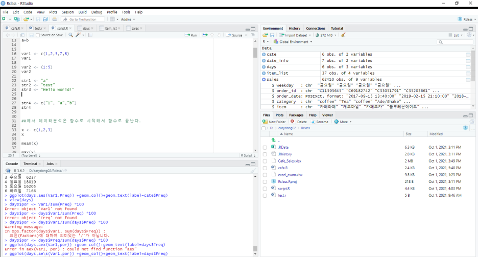
var1 <- c(1, 2, 5, 7, 8)   # c()로 벡터 생성
var2 <- (1:5)              # 범위
str4 <- c("1", "a", "b")   # 문자열 벡터

mean(x)   # 평균
max(x)    # 최대
min(x)    # 최소
| 요소 | 설명 |
|---|---|
<- | 대입 연산자 |
c() | 벡터(배열) 생성 |
(1:5) | 범위 |
mean/max/min | 통계 함수 |
2. ggplot2 — 시각화
1
2
3
4
5
6
install.packages("ggplot2")
library(ggplot2)

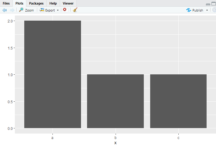
qplot(x)   # 간단한 막대그래프
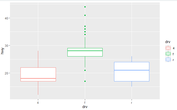
qplot(data = mpg, x = drv, y = hwy, geom = "boxplot", colour = drv)
?mpg       # ?를 붙이면 문서 조회(javadoc처럼)
💡 함수 앞에
?를 붙이면 문서를 볼 수 있다(?mpg).mpg는 자동차 데이터셋으로,drv=구동방식,hwy=고속도로 연비다.geom은 플롯 형태(boxplot 등)를 정하는 옵션이다.
3. data.frame & 엑셀 읽기
1
2
3
4
5
6
7
8
eng <- c(90, 80, 60, 70)
math <- c(50, 60, 90, 30)
df_mid <- data.frame(eng, math)
mean(df_mid$eng)          # $로 열 접근

install.packages('readxl')
library(readxl)
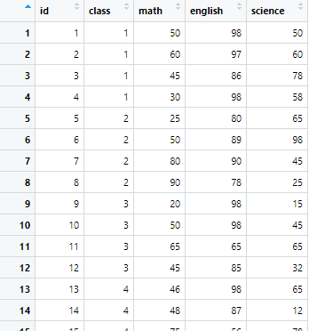
df_exam <- read_excel('excel_exam.xlsx')
데이터 확인 함수:
| 함수 | 역할 |
|---|---|
head() / tail() | 앞/뒤 6행 |
str() | 열 속성·구조 |
dim() | 행·열 개수 |
summary() | 요약 통계 |
View() | 파일 열어보기(V 대문자!) |
4. dplyr — 데이터 가공
1
2
3
4
5
6
7
8
9
10
11
12
install.packages("dplyr")
library(dplyr)

df_new <- rename(df_new, v2 = var2)     # 열 이름 변경

# 파생변수 만들기
df$sum <- df$var1 + df$var2
mpg_new$total <- (mpg_new$city + mpg_new$highway) / 2

# 조건 분기(ifelse 중첩)
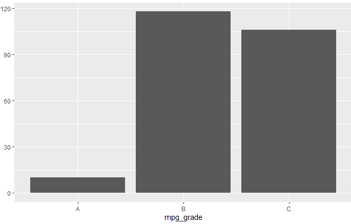
mpg_grade <- ifelse(mpg_new$total >= 30, 'A',
             ifelse(mpg_new$total >= 20, 'B', 'C'))
💡 파생변수는
df$새이름 <- 계산식으로 만든다.ifelse(조건, 참, 거짓)을 중첩하면 여러 구간(A/B/C)으로 등급을 나눌 수 있다.
5. 실전 — 카페 판매 데이터 분석
결측치 제거 & 탐색
1
2
3
4
5
6
sales <- read_xlsx('Cafe_Sales.xlsx')
table(is.na(sales))       # 결측치 개수 요약
sales <- na.omit(sales)   # 결측치 제거

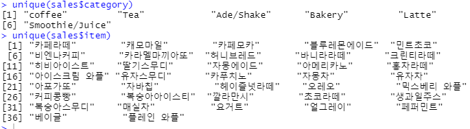
unique(sales$category)    # 중복 제거해 카테고리 조회
unique(sales$item)
매출액 계산 (merge)
1
2
3
4
5
sales_tr <- data.frame(table(sales$item))               # 품목별 판매량
sales_item <- unique(subset.data.frame(sales, select = c('item','price')))
item_list <- merge(sales_tr, sales_item, by.x = 'Var1', by.y = 'item')
item_list$amount <- item_list$Freq * item_list$price    # 판매량 × 가격
sum(item_list$amount)                                    # 총 매출액
💡
merge()는 두 데이터프레임을 공통 키로 합친다(SQL JOIN과 유사). 판매량(Freq)과 가격(price)을 합쳐 파생변수amount로 매출을 계산하고,sum()으로 총매출을 낸다.
요일·계절별 분석
1
2
3
4
5
6
7
8
9
10
11
12
13
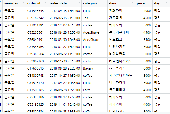
# 요일 → 평일/주말
sales$weekday <- weekdays(sales$order_date)
date_info <- data.frame(
  weekday = c('월요일','화요일','수요일','목요일','금요일','토요일','일요일'),
  day = c('평일','평일','평일','평일','평일','주말','주말'))
sales <- merge(sales, date_info)

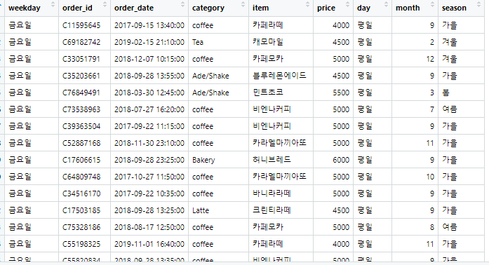
# 월 → 계절
sales$month <- as.integer(gsub('월', '', months(sales$order_date)))
sales$season <- ifelse(sales$month >= 12, "겨울",
                ifelse(sales$month >= 9, '가을',
                ifelse(sales$month >= 6, '여름', '봄')))
table(sales$season)
최종 시각화
1
2
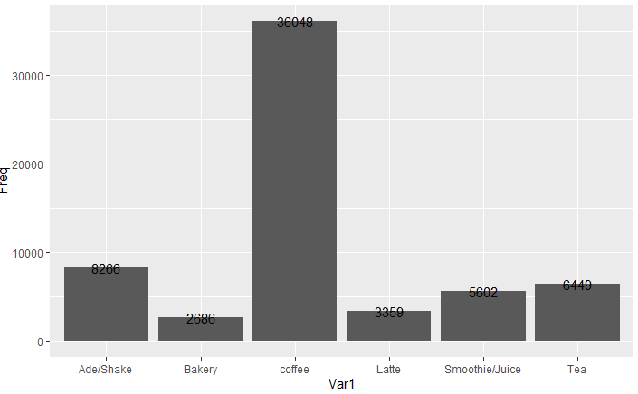
cate <- data.frame(table(sales$category))
ggplot(cate, aes(Var1, Freq)) + geom_col() + geom_text(label = cate$Freq)
💡
ggplot()은 레이어를+로 쌓는 문법이다.aes()로 x·y축을 정하고,geom_col()(막대)·geom_text()(값 표시)를 더해 완성한다.
📝 정리
1
2
3
4
5
R 데이터 분석
├─ 문법   <- 대입, c() 벡터, data.frame
├─ 시각화 ggplot2(qplot·geom_col), ? 문서
├─ 가공   dplyr(rename·파생변수·ifelse)
└─ 실전   결측치 제거→merge→매출/요일/계절 분석
| 개념 | 한 줄 정의 |
|---|---|
| data.frame | 표 형태 데이터 |
| ggplot2 | 레이어 기반 시각화 |
| merge | 데이터프레임 JOIN |
R의 핵심은 벡터·데이터프레임으로 데이터를 다루고, ggplot2로 시각화하는 것이다. dplyr의 파생변수·merge·ifelse를 조합하면 카페 매출처럼 실제 데이터를 요일·계절 등 다양한 관점으로 분석할 수 있다.
This post is licensed under CC BY 4.0 by the author.
Comments powered by Disqus.